Project
UBC Third Quadrant Design
Client
Third Space Properties
Role
Creative Direction
UBC Third Quadrant Design
Client
Third Space Properties
Role
Creative Direction

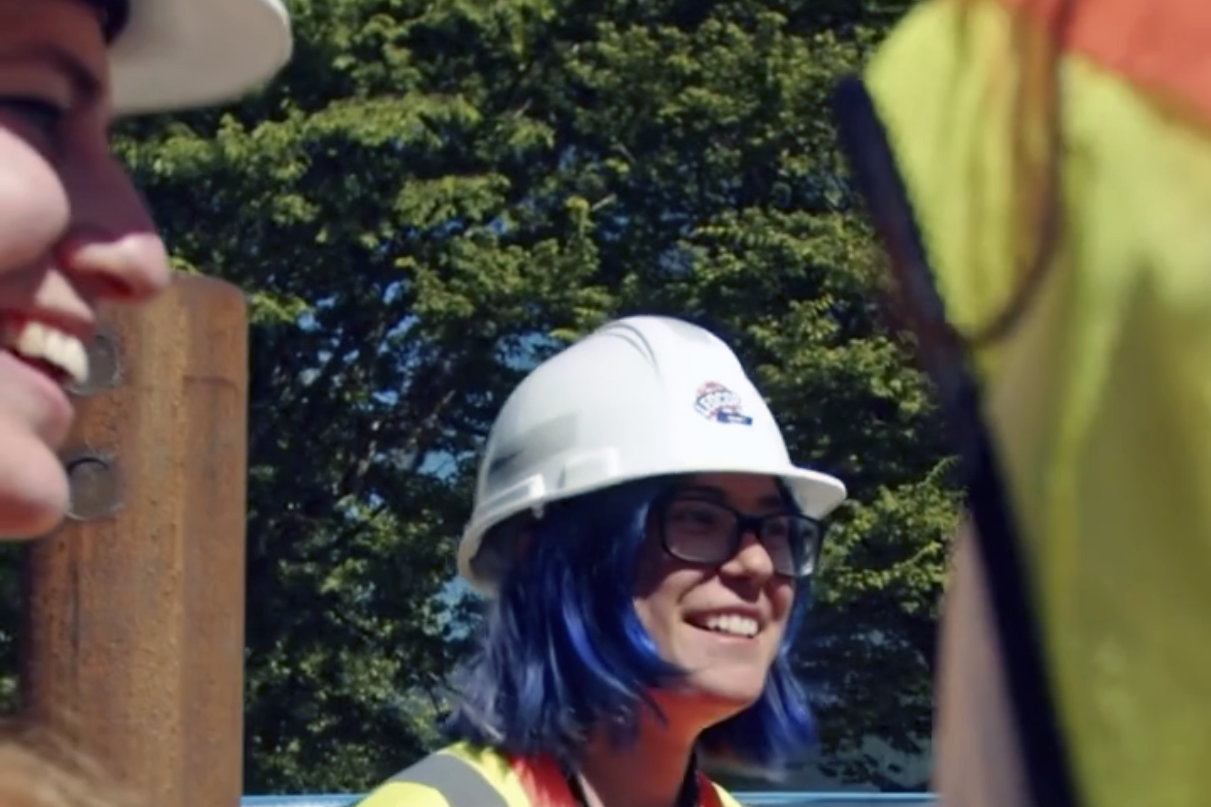
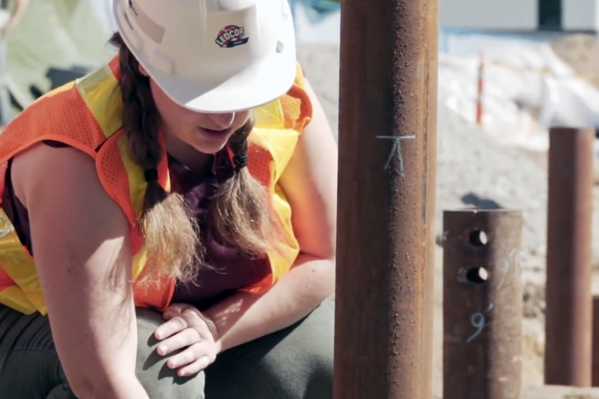
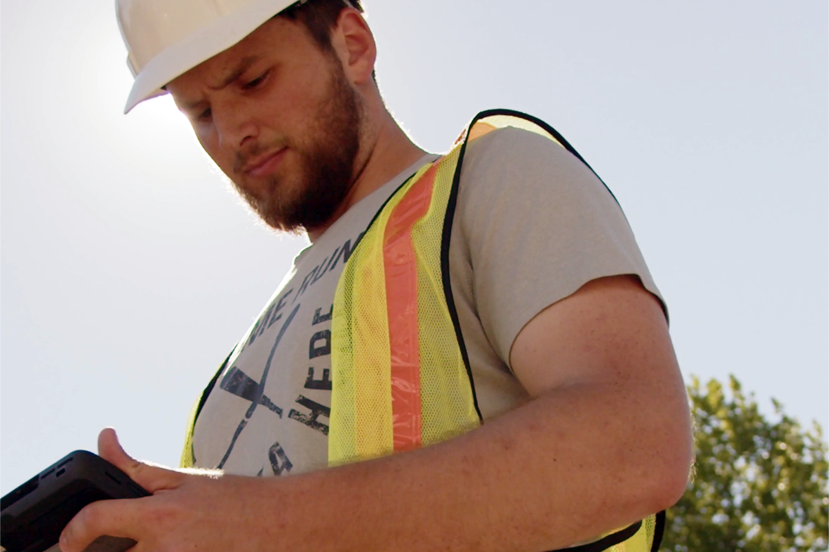
Third Space, a new Vancouver-based property developer, wanted to tell the story of UBC’s Third Quadrant Design and doing things differently to shift build culture.
 ︎ Reel 01: Who is Third Quadrant Design?
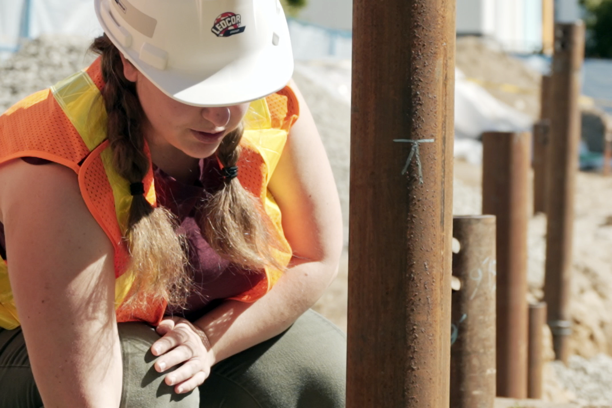 ︎ Reel 02: Carbon Minimalism
 ︎ Reel 04: The Living Lab
The Threshold
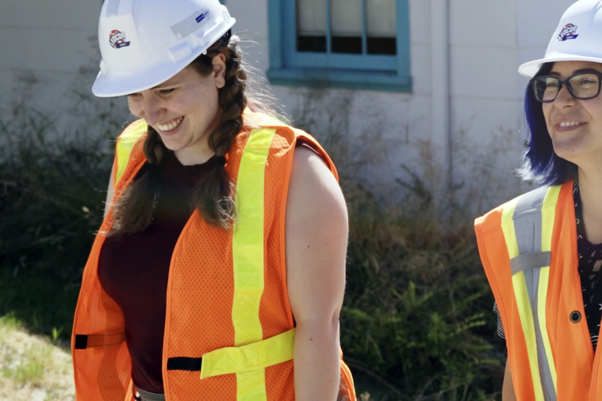
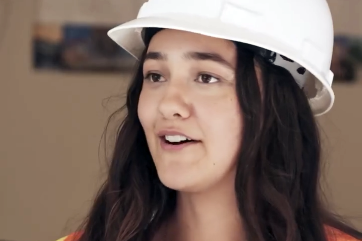
A property company wanted to tell a regenerative building story. The story had many dimensions—carbon math, feminist engineering histories, materials science, campus culture. Three female team captains in a historically male field. A net-zero academic space that was also a living lab. Innovation that invited more than the usual sponsor narrative.
The question: how do you honour complexity in a two-minute Instagram reel?
The Work
Teaming up with the engineering, architecture, and design students to find what was trying to become visible. Not "capture the project" but discover what the project was revealing about how we build differently.
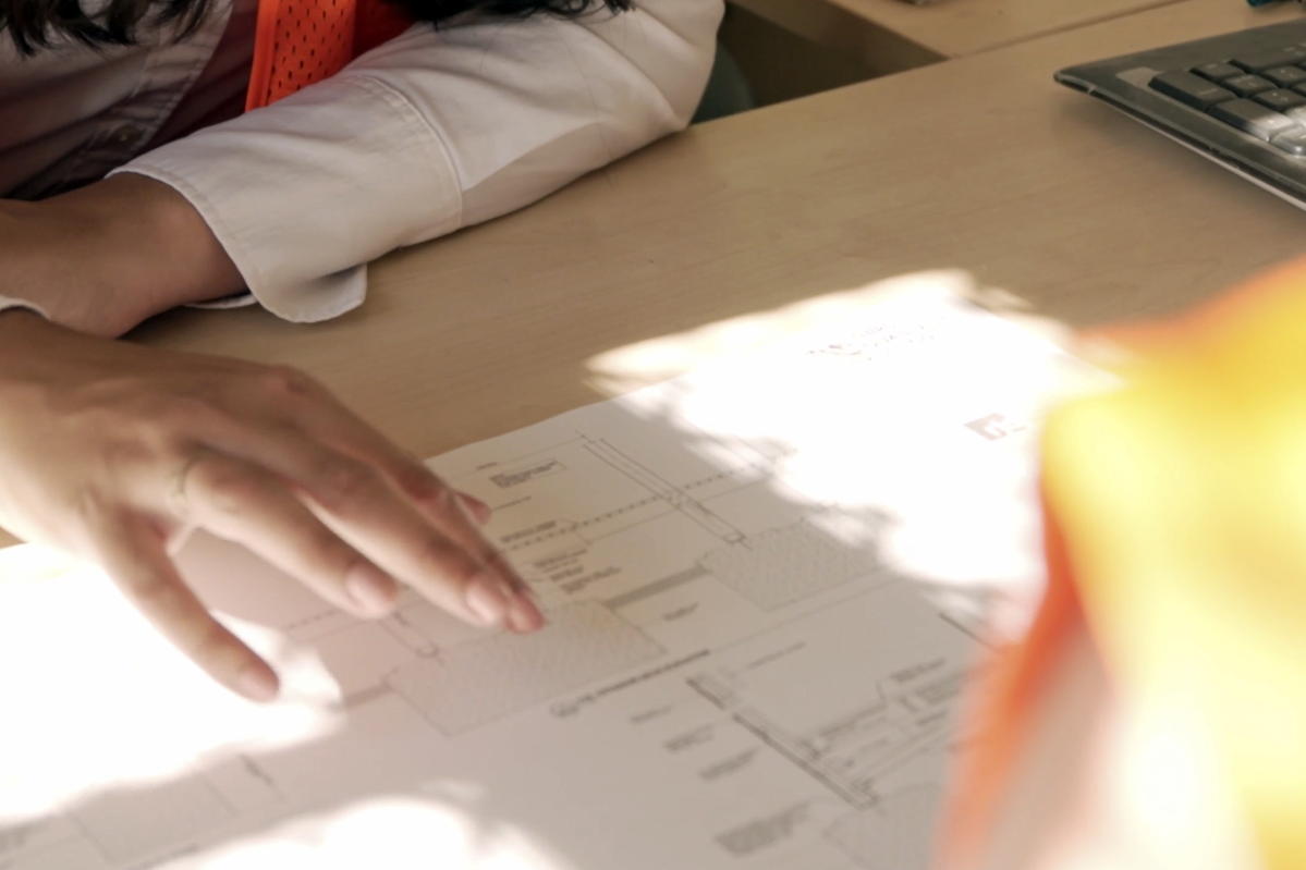
Developed scripts collaboratively—listening for where technical language held poetry, where measurements became metaphor. The four-part series moved between scales: close-up testimonies of the captains, material intimacy at the construction site, drone perspectives showing the campus as context.
Each piece isolated a threshold: Who is this team? What is carbon minimalism when you're actually touching foundation piles? How does a building become a catalyst? What makes a lab "living"?
Shot list designed for breath—switching between interview, B-roll, aerial—so complexity could pace itself. Sponsorship branding kept minimal. The company's role: making space.
A property company wanted to tell a regenerative building story. The story had many dimensions—carbon math, feminist engineering histories, materials science, campus culture. Three female team captains in a historically male field. A net-zero academic space that was also a living lab. Innovation that invited more than the usual sponsor narrative.
The question: how do you honour complexity in a two-minute Instagram reel?
The Work
Teaming up with the engineering, architecture, and design students to find what was trying to become visible. Not "capture the project" but discover what the project was revealing about how we build differently.
Developed scripts collaboratively—listening for where technical language held poetry, where measurements became metaphor. The four-part series moved between scales: close-up testimonies of the captains, material intimacy at the construction site, drone perspectives showing the campus as context.
Each piece isolated a threshold: Who is this team? What is carbon minimalism when you're actually touching foundation piles? How does a building become a catalyst? What makes a lab "living"?
Shot list designed for breath—switching between interview, B-roll, aerial—so complexity could pace itself. Sponsorship branding kept minimal. The company's role: making space.
What Made It Possible
The students trusted me to not simplify their work. The sponsor trusted me to not reduce it to branding. A production team (Bokuria Creative) that understood documentary rigor. A concept partner (Amy Médard de Chardon) who saw the gender story without making it the only story.
And time in the disorienting middle—where we didn't know yet if this was about buildings or belief systems, about materials or making room for different minds to lead.
The first video pulled a 9.5% engagement rate. But the real outcome: the team's intelligence became watchable. Their rigor, their refusal of shortcuts, their interdisciplinarity—all of it held in two-minute forms that didn't betray the substance.
Credits
Creative Direction: Alana McFarlane
Concept: Amy Médard de Chardon
Script, Team Liaison: Milan Jaan
Video Production: Bokuria Creative
Social Media: Publish Partners
Client: Third Space Properties


Project
Radon Atlas of Canada
Client
Radon Environmental
Roles
Research, Copywriting,
Art Direction, Graphic Design
Radon Atlas of Canada
Client
Radon Environmental
Roles
Research, Copywriting,
Art Direction, Graphic Design
 An invisible carcinogen in Canadian homes. Decades of geoscience data that couldn't translate itself to public urgency. Radon Environmental—a company preventing exposure to the second leading cause of lung cancer worldwide—needed something that didn't exist yet: a visual learning resource that could speak simultaneously to researchers, industry, property developers, and homeowners.


The Threshold
The gap wasn't just between science and public. It was between disciplines. Geoscientists understood bedrock. Health physicists understood dosage. Policy people understood building codes. But no one had a shared visual language for understanding geology's role in the radon story.
Thirty-five percent of countries have radon data mapped. Those maps increase awareness, guide building codes, prioritize where detectors go. Canada needed one. But how do you design for trust when the entire country is at some level of risk? How do you communicate "everywhere is dangerous, but differently" without paralyzing people?
The Work
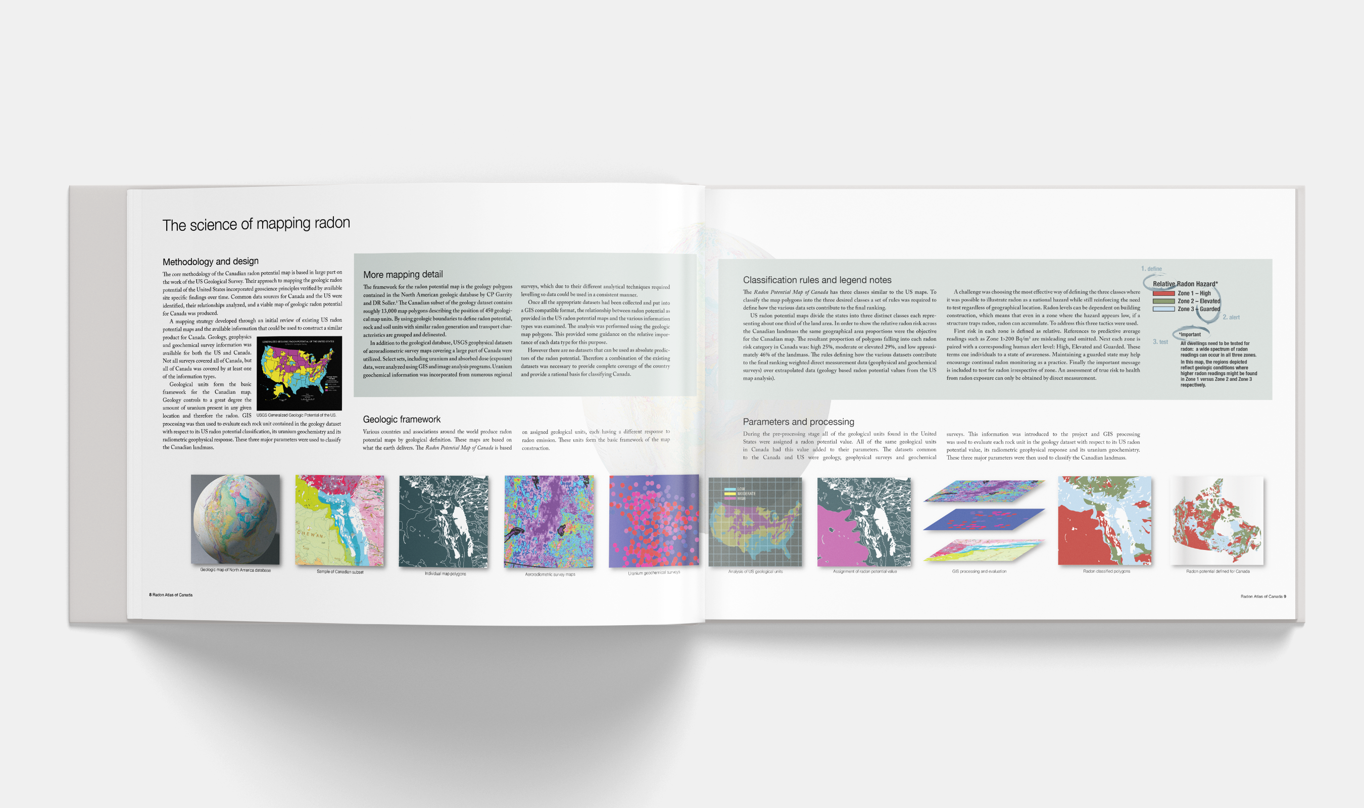
Embedded with geoscientists, GIS experts, entrepreneurs. Research phase moved between NRC mapping resources and government radon risk maps from other countries—looking for what makes a map legible to both experts and the public simultaneously.
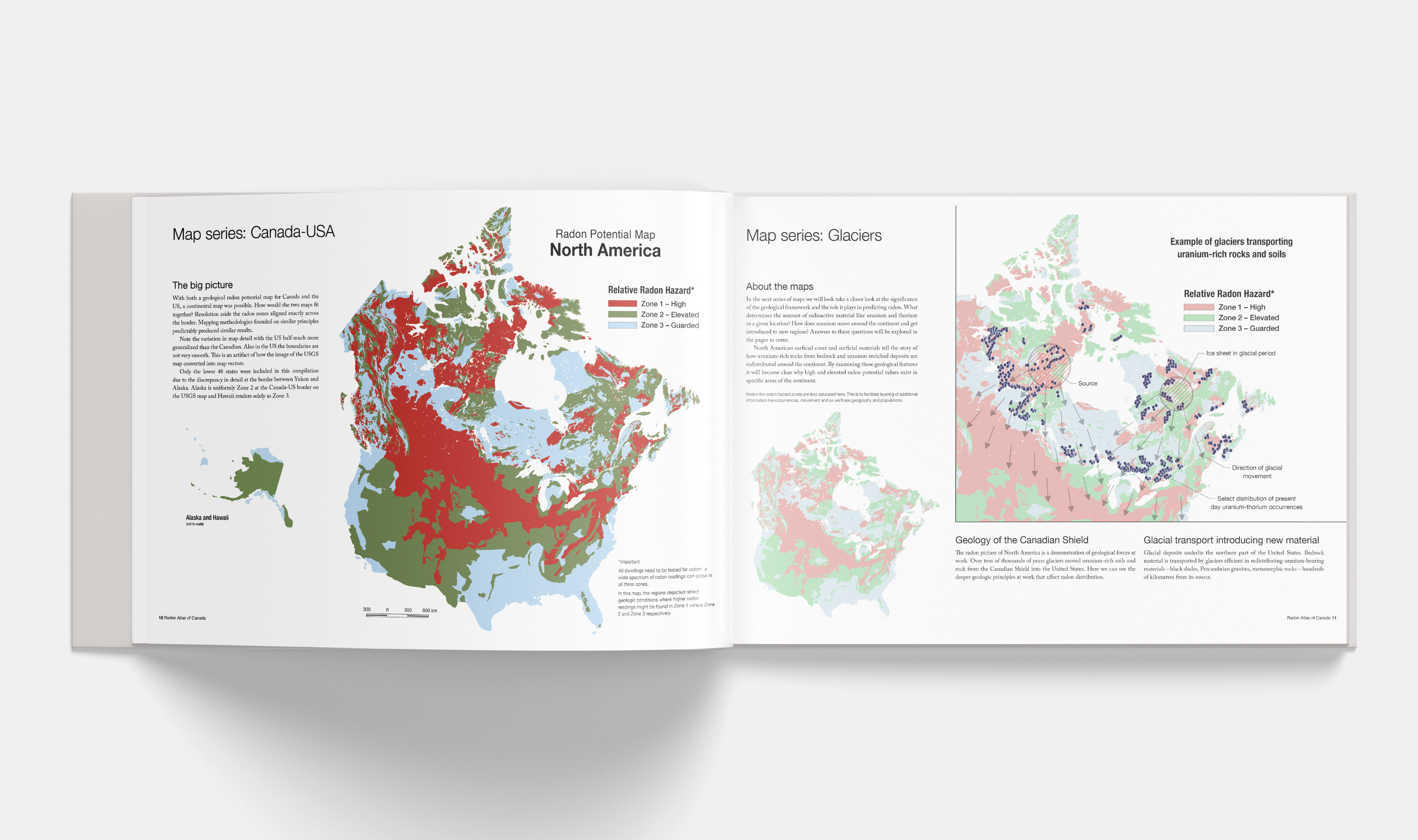
The design challenge landed on colour. Every zone had risk. The usual green-yellow-red didn't work—green implies safety, and nowhere was safe. Studied the USGS approach. Settled on three zones defined by color and human alert levels: red/high, green/elevated, blue/guarded. The colour strategy had to be accessible, had to match the level of urgency without inciting panic, had to let people locate themselves geographically and emotionally.
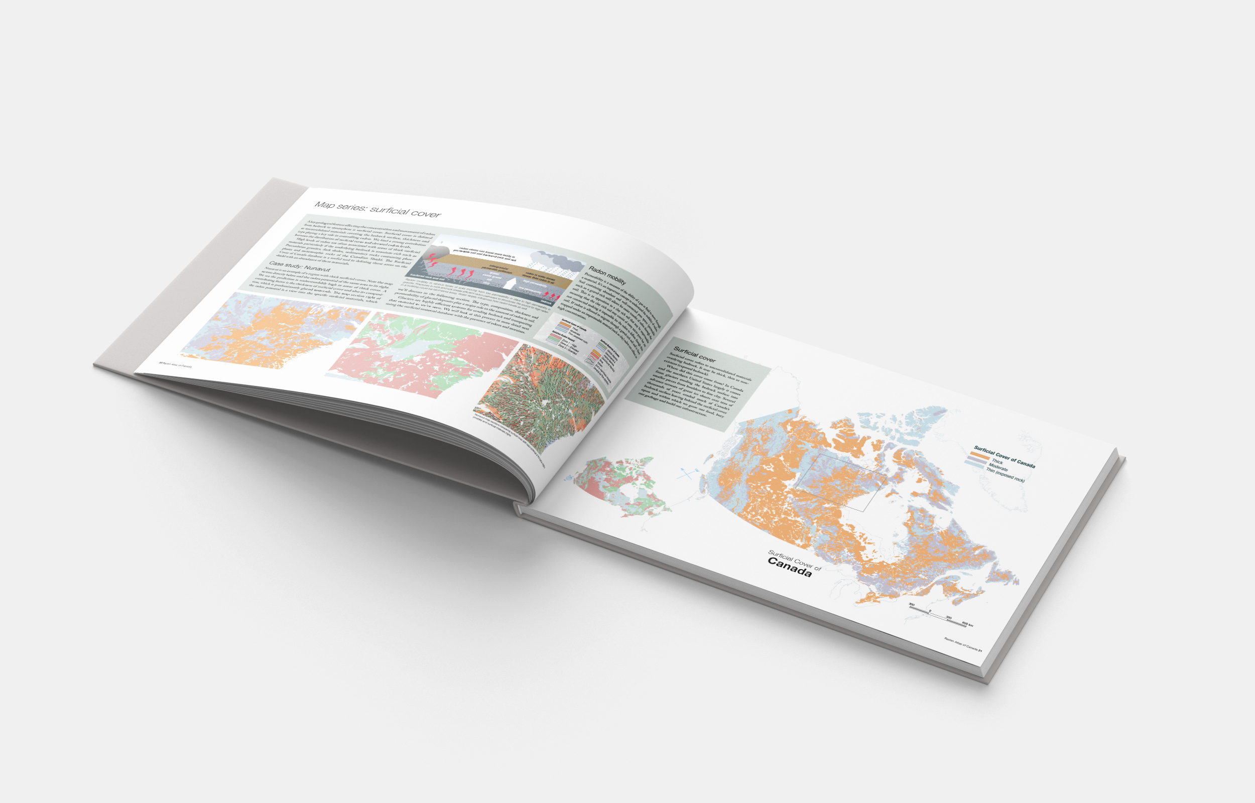
Developed the Radon Potential Map of Canada first—the base layer. Then built an overlay series with a tinted palette investigating relationships: human use and activity, regional population studies with First Nations, projected growth areas. Each overlay asking: where are people, where will they be, where does the ground beneath them hold the most risk?
The final form: a large-format book, digital and print. Not a government document but designed to feel like one—borrowing the visual authority of National Research Council publications to build trust. Plain language throughout. Full map series, introduction to health physics, mapping methodology, case studies showing how to read your own risk.
Worked across disciplines without flattening them. The geoscientists' precision held. The health communicators' clarity held. The design didn't simplify—it structured. Made the relationships visible.
The gap wasn't just between science and public. It was between disciplines. Geoscientists understood bedrock. Health physicists understood dosage. Policy people understood building codes. But no one had a shared visual language for understanding geology's role in the radon story.
Thirty-five percent of countries have radon data mapped. Those maps increase awareness, guide building codes, prioritize where detectors go. Canada needed one. But how do you design for trust when the entire country is at some level of risk? How do you communicate "everywhere is dangerous, but differently" without paralyzing people?
The Work
Embedded with geoscientists, GIS experts, entrepreneurs. Research phase moved between NRC mapping resources and government radon risk maps from other countries—looking for what makes a map legible to both experts and the public simultaneously.
The design challenge landed on colour. Every zone had risk. The usual green-yellow-red didn't work—green implies safety, and nowhere was safe. Studied the USGS approach. Settled on three zones defined by color and human alert levels: red/high, green/elevated, blue/guarded. The colour strategy had to be accessible, had to match the level of urgency without inciting panic, had to let people locate themselves geographically and emotionally.
Developed the Radon Potential Map of Canada first—the base layer. Then built an overlay series with a tinted palette investigating relationships: human use and activity, regional population studies with First Nations, projected growth areas. Each overlay asking: where are people, where will they be, where does the ground beneath them hold the most risk?
The final form: a large-format book, digital and print. Not a government document but designed to feel like one—borrowing the visual authority of National Research Council publications to build trust. Plain language throughout. Full map series, introduction to health physics, mapping methodology, case studies showing how to read your own risk.
Worked across disciplines without flattening them. The geoscientists' precision held. The health communicators' clarity held. The design didn't simplify—it structured. Made the relationships visible.
What Made It Possible
A client (Radon Environmental) who understood that communication was prevention. A team willing to work in the overlap: producer/editor Alan Whitehead, creative director/geoscience lead Dan Innes, geoscience consultants Frederick Breaks and Tom Morris, GIS lead Ward Kilby.
The recognition that this wasn't a branding project or a data visualization project but both—and neither. It was a translation project. Making geology legible as health risk. Making national-scale patterns meaningful at the scale of "should I test my home?"
Time to research how other countries had approached this. Access to the full geoscience data. Trust to develop a colour strategy that broke from convention because convention wasn't working.
First published 2011. Now in its third edition. Widely cited by Lung Associations, BC Centre for Disease Control, University of Calgary. Provincial and territorial maps now available for planners and developers. Published in the Canadian Journal of Public Health.
The outcome that matters: a shared visual intelligence across disciplines. Researchers, policy makers, property developers, homeowners—all looking at the same map, all able to act from it.
Credits
Research, Copywriting, Art Direction, Graphic Design: Alana McFarlane
Producer, Editor: Alan Whitehead
Creative Director, Geoscience Lead: Dan Innes
Geoscience Consultants: Frederick Breaks, Tom Morris
GIS Lead: Ward Kilby
Client: Radon Environmental
Publication
Hystad P, Brauer M, Demers PA, Johnson KC, Setton E, Cervantes-Larios A, Poplawski K, McFarlane A, Whitehead A, Nicol AM (2012) Geographic variation in radon and associated lung cancer risk in Canada. Canadian Journal of Public Health:105(1):e4-10. doi.org/10.17269/cjph.105.4002
Project
National SCI Care Strategy
Client
Praxis Spinal Cord Institute
Roles
Branding, Communications Strategy
Graphic Design
National SCI Care Strategy
Client
Praxis Spinal Cord Institute
Roles
Branding, Communications Strategy
Graphic Design
 Spinal cord injury care in Canada—fragmented across provinces, scattered between rural and urban centres, siloed between research and practice, between clinicians and people with lived experience. No shared language. No national vision. Just pockets of excellence that couldn't see each other. The time had come to connect Canada's research, practice, and care sectors with a shared vision.

The Threshold
Praxis Spinal Cord Institute, positioned as a 'networker of networks,' had convened years of consultations. Stakeholders had spoken: researchers, clinicians, patients, caregivers, policymakers, community organizations. What surfaced was a common refrain—"be bold." The time had come to connect Canada's research, practice, and care sectors with a shared vision.
But here was the threshold: how do you translate a co-creation process into real-world change? How do you design for a network that spans from isolated rural communities to major urban research centres, each with radically different access to resources, capacity, and time?
The challenge wasn't just making a strategy document. It was animation—moving the framework from pages into living practice. Making it low-barrier enough that people could actually engage. Making it feel like invitation, not obligation.
The Work
Collaborating with a team of researchers, knowledge translators, people with lived experience, and strategy developers. Regular meetings with the Praxis working groups to understand the vast network they stewarded—clinicians, community champions, regional interest groups, international organizations. Each with different vocabularies, different priorities, different constraints.
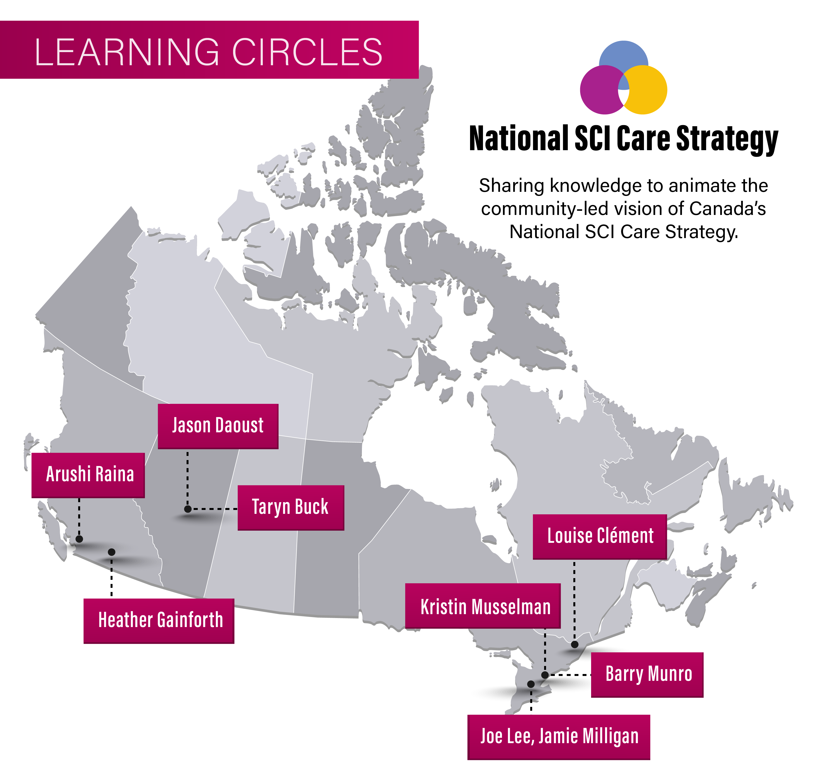
The communications approach centered on grassroots storytelling through Learning Circles—knowledge-sharing events that would surface stories of care excellence already happening across Canada. The idea: trusted community champions, people with influence and respect in their regions, sharing what worked so others could adapt it locally.
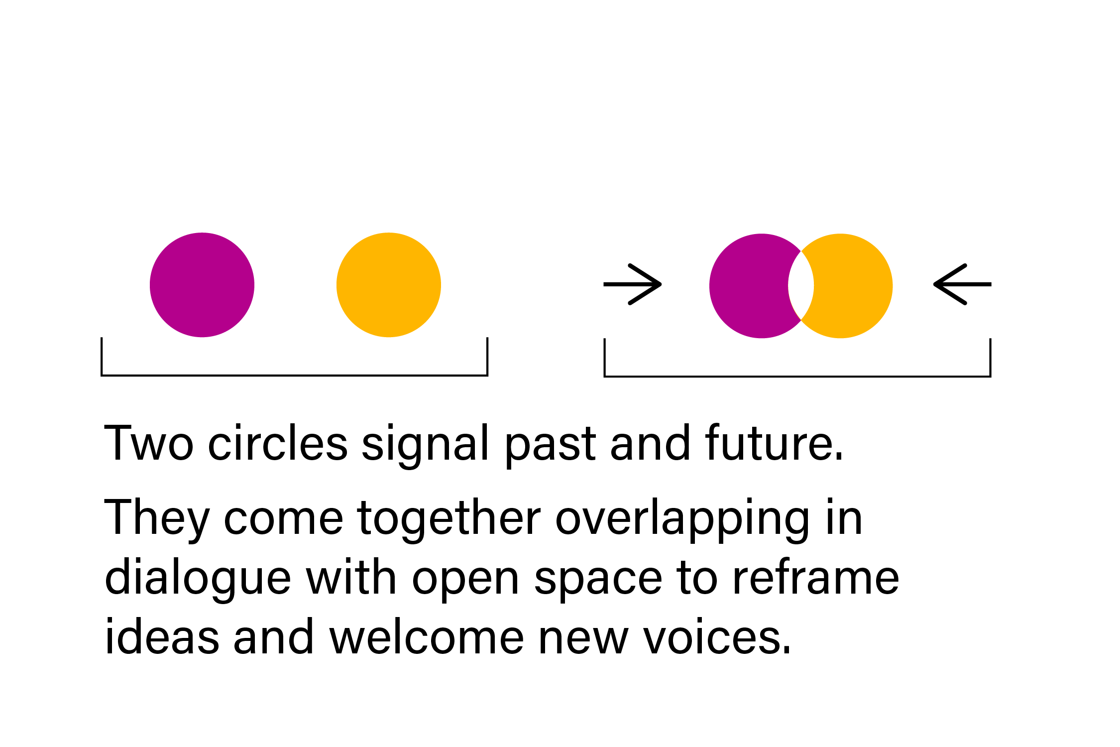
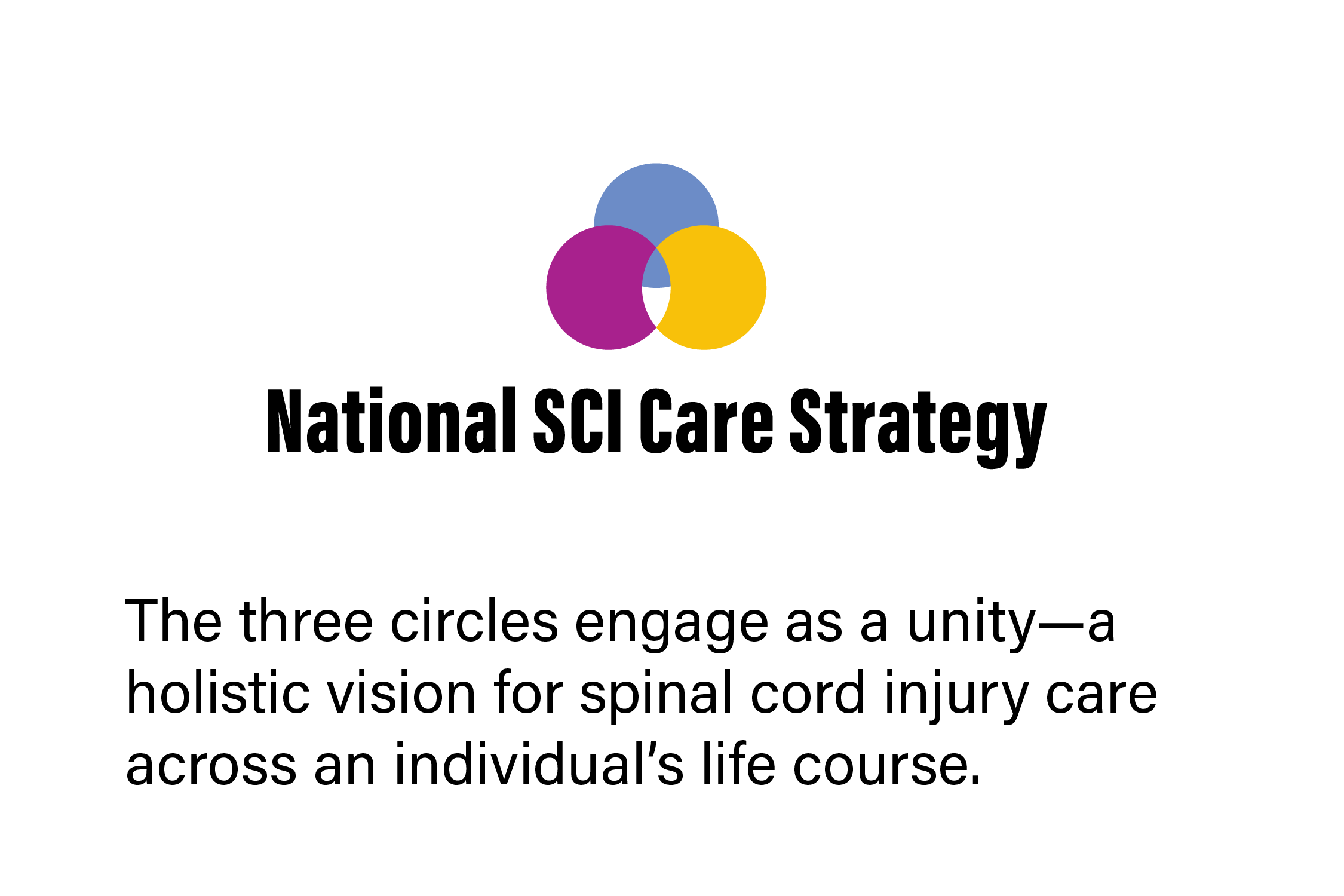
Developed a visual identity rooted in the Praxis brand palette. Selected the brightest hues for joyous, dynamic presence. The logo system: three circles engaging as unity. Two circles representing past and future, overlapping in dialogue with open space to welcome new voices. A third voice entering from above in violet-red blue—encouraging collaboration with imaginative, harmonious expression. The three circles together: a holistic vision for SCI care across an individual's life course.
Created branded communications materials that could travel across contexts—urban research hospitals, rural rehabilitation centres, community support groups. Designed for reach and accessibility.
The strategy had to live beyond a launch. Regular themed digests on Learning Circles enriched with local and national news. Recorded interviews with care champions coast-to-coast. An invitation for people making impact in the SCI community to share their stories for future knowledge-sharing.
![Map of Canada with pink boxes of names, National SCI Care Strategy logo and text "Sharing knowledge to animate the community-led vision of Canada's National SCI Care Strategy."]()
Map of Learning Circles led coast-to-coast by Arushi Raina, Jason Daoust, Heather Gainforth, Taryn Buck, Kristin Musselman, Louise Clément, Barry Munro, Joe Lee and Jamie Milligan.
Praxis Spinal Cord Institute, positioned as a 'networker of networks,' had convened years of consultations. Stakeholders had spoken: researchers, clinicians, patients, caregivers, policymakers, community organizations. What surfaced was a common refrain—"be bold." The time had come to connect Canada's research, practice, and care sectors with a shared vision.
But here was the threshold: how do you translate a co-creation process into real-world change? How do you design for a network that spans from isolated rural communities to major urban research centres, each with radically different access to resources, capacity, and time?
The challenge wasn't just making a strategy document. It was animation—moving the framework from pages into living practice. Making it low-barrier enough that people could actually engage. Making it feel like invitation, not obligation.
The Work
Collaborating with a team of researchers, knowledge translators, people with lived experience, and strategy developers. Regular meetings with the Praxis working groups to understand the vast network they stewarded—clinicians, community champions, regional interest groups, international organizations. Each with different vocabularies, different priorities, different constraints.
The communications approach centered on grassroots storytelling through Learning Circles—knowledge-sharing events that would surface stories of care excellence already happening across Canada. The idea: trusted community champions, people with influence and respect in their regions, sharing what worked so others could adapt it locally.
Developed a visual identity rooted in the Praxis brand palette. Selected the brightest hues for joyous, dynamic presence. The logo system: three circles engaging as unity. Two circles representing past and future, overlapping in dialogue with open space to welcome new voices. A third voice entering from above in violet-red blue—encouraging collaboration with imaginative, harmonious expression. The three circles together: a holistic vision for SCI care across an individual's life course.
Created branded communications materials that could travel across contexts—urban research hospitals, rural rehabilitation centres, community support groups. Designed for reach and accessibility.
The strategy had to live beyond a launch. Regular themed digests on Learning Circles enriched with local and national news. Recorded interviews with care champions coast-to-coast. An invitation for people making impact in the SCI community to share their stories for future knowledge-sharing.
Map of Learning Circles led coast-to-coast by Arushi Raina, Jason Daoust, Heather Gainforth, Taryn Buck, Kristin Musselman, Louise Clément, Barry Munro, Joe Lee and Jamie Milligan.
What Made It Possible
A client (Praxis Spinal Cord Institute) who understood that strategy without animation is just documentation. A team that included researchers Vanessa Noonan (lead) and Christiana Cheng, knowledge translation and communications leads Charlene Yousefi and Joanna Rivera, strategy developers Cense Ltd., marketing communications from Amanda Maxwell, social media from Nandhini Sasikumar.
The recognition that "national" doesn't mean top-down. It means creating conditions for local adaptation. Honouring that rural communities face different barriers than urban ones. That capacity for engagement is a real constraint—if time and energy become obstacles, the strategy does not lift from the page.
Years of prior consultation work that had already built trust and surfaced what mattered. The bold recommendation from stakeholders that Canada needed this. Funding from the Government of Canada that made sustained work possible.
My particular contribution: understanding that branding and communications strategy for a healthcare initiative means designing for dignity and collaboration, not just visibility. Making the visual language joyous. Creating systems that could hold complexity while remaining welcoming.
The outcome: Learning Circles led coast-to-coast by champions across the country. A map of knowledge-sharing that connects regions and practices. Published in Frontiers in Public Health as a community case study on development, communication, dissemination, and evaluation.
But the real measure: a framework that's being animated, not archived. A strategy living in practice, adapted regionally, sustained by the community it serves.
Credits
Branding, Communications Strategy, Graphic Design: Alana McFarlane
Researchers: Vanessa Noonan (Lead), Christiana Cheng
Knowledge Translation, Communications: Charlene Yousefi, Joanna Rivera
Strategy Development: Cense Ltd.
Marketing Communications: Amanda Maxwell
Social Media: Nandhini Sasikumar
Client: Praxis Spinal Cord Institute
Publication
Rivera JMB, Yousefi C, Cheng CL, Norman CD, Legare J, McFarlane A and Noonan VK (2022) Optimizing spinal cord injury care in Canada: Development of a framework for strategy and action. Frontiers in Public Health 10:921926. doi:10.3389/fpubh.2022.921926
Project
Barnacle: A Threshold
Client
Personal Project
Roles
Story, Photography, Film,
Sound, Web Design
Barnacle: A Threshold
Client
Personal Project
Roles
Story, Photography, Film,
Sound, Web Design

The space between—after endings, before beginnings.
Barnacle is where I practice threshold work without a client brief. No deliverable except honesty about what it means to work in states of not-knowing. A personal investigation that keeps the rest of my practice from calcifying.

The Threshold
︎
wading along edges. the before-time traces a disorienting path, depositing a sudden quietness. middle ways soften. light confuses bones with flowers. the beginning plays as a trickster. an upside down is now very sensible. noise dissolves the unwritten. shoulders bear illogical forms.
evasive boundaries. dwellings call from six directions. not quite here and not yet there.
︎
The Work
This is the practice that reminds me: thresholds are generative. The disorienting middle is where form wants to emerge. Uncertainty isn't something to rush through—it's where collaborative intelligence actually lives.
Barnacle punctuates constant change. Not quite a project, but a space to be curious. It's how I stay honest about working with complexity and remember that not-knowing is a skill.
What Made It Possible
Barnacle is providing space for a personal documentary project that begins filming in 2026. The Lytton Project—a visual exploration of memory and ground.
In February, I return to the site of the first home I shared with my adopted grandmother. The wildfire of June 2021 erased the village buildings, the physical traces of those first stories. I'm creating a poetic documentary on what emerges now. The threshold space of becoming when the structures of memory are gone but the ground remains.
Website
https://barnacle.cargo.site/
